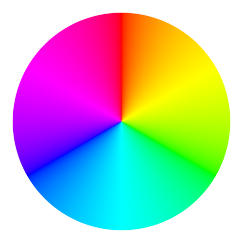
The Color Wheel
The color wheel is one of the most important tools in color theory, and it was first developed by Sir Isaac Newton in 1704 when he bent white light through a prism and saw that it split into a rainbow of colors. Newton arranged these colors in a circle, creating the first color wheel. The modern color wheel shows primary colors (red, yellow, blue), secondary colors (orange, green, purple), and tertiary colors (like red-orange and blue-green) arranged in a circle so that related colors sit next to each other. The color wheel makes it easy to see relationships between colors and predict how they will look when placed together. Every artist and designer should be familiar with the color wheel because it is the foundation of all color decisions.
Color Harmonies

Color harmonies are specific combinations of colors on the color wheel that are known to work well together. Complementary colors sit directly opposite each other on the wheel — like red and green or blue and orange — and when placed side by side, they make each other look brighter and more intense. Analogous colors sit next to each other on the wheel — like blue, blue-green, and green — and create a calm, harmonious feeling. Triadic color schemes use three colors equally spaced around the wheel, like red, yellow, and blue, creating a vibrant and balanced look. Designers and artists choose color harmonies carefully based on the mood they want to create, and knowing these schemes gives you a reliable starting point for any color decision.
The Psychology of Color
Colors can affect our emotions and even our behavior, and this is something advertisers, restaurant owners, and interior designers take very seriously. Red is associated with excitement, energy, and urgency, which is why it is commonly used for sale signs and stop signals. Blue tends to feel calm, trustworthy, and peaceful, making it a popular choice for banks and social media platforms. Yellow is cheerful and attention-grabbing, while green is associated with nature, health, and freshness. However, color meanings are not universal — in many Western countries, white represents purity and is worn at weddings, while in some East Asian cultures, white is the color of mourning. Understanding how colors make people feel helps artists create specific moods in their work.
Hue, Saturation, and Value
Every color can be described using three properties: hue, saturation, and value. Hue is simply the name of the color — red, blue, yellow, and so on. Saturation describes how pure or intense a color is — a highly saturated red is bright and vivid, while a less saturated red looks muted and grayish. Value refers to how light or dark a color is, from the palest tint to the deepest shade. These three properties give artists precise control over the exact color they want to use. The Pantone color system, used by designers and manufacturers worldwide, assigns a unique number to thousands of specific colors to ensure that everyone is talking about exactly the same shade.
Using Color Theory in Your Art
You do not need to memorize every rule of color theory to benefit from it — just understanding the basics will improve your artwork significantly. Try creating a painting using only complementary colors and notice how they make each other pop, then try one with only analogous colors and see how the mood changes. Pay attention to the colors used in your favorite movies, books, and video games, and think about why the designers chose those particular combinations. Experimenting with limited color palettes — using only three or four colors in a piece — can actually make your art stronger because it forces you to think carefully about every color choice. The more you practice thinking about color, the more naturally good color decisions will come to you.